
This set of photographs aims to incorporate the insights I have learned so far into one type of subject. I began with man made structures but found that my interpretations of the brief were somewhat predictable, then I moved onto sillouhettes formed by shadows. I enjoyed working on these but felt that the results were too one dimensional and failed to address the targets identified from my first assignment feedback, these being;
- experimenting with viewpoints / angle of view.
- simplifying composition.
- consistency of vision and composition.
- lighting.
I spent some time observing everyday 'objects' to identify something that both interested me and met the assignment criteria. I felt that the human body would be an interesting subject with which to try to achieve the required goals and effects.
I opted to follow the suggestion in the course notes of working in black and white in order to illustrate the graphic elements of the composition without relying on colour to accentuate them.
Single point dominating the composition.
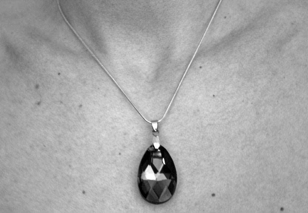 |
| Manual mode f5.6 Exp 1.3sec Iso 200 Focal Length 55mm WB manual. |
Two points.
 |
| Manual mode f4 1.6sec Iso 100 FL 46mm WB auto |
Several points in a deliberate shape.
 |
| Manual mode f5.6 1.3sec Iso 200 FL 55mm WB manual |
A combination of horizontal and vertical lines.
 |
| Manual mode f4 1/5sec Iso 200 FL42mm WB Auto |
Diagonals.
 |
| Manual mode f5 1.6sec Iso 200 FL 45mm WB manual |
Curves.
 |
| Manual mode f4 1/3 sec Iso 400 FL 70mm WB auto |
Distinct, even if irregular, shapes.
 |
| Manual mode f5.6 1/2sec Iso 200 FL 55mm WB manual |
At least two kinds of implied triangle.
 |
| Manual mode f4 1/5sec Iso 200 FL25mm WB auto |
 |
| Manual mode f4 1/2sec Iso 400 FL23mm WB auto |
Rhythm.
 |
| Manual mode f4 1/4sec Iso 100 FL70mm WB auto |
Pattern.
 |
Manual mode f5.6 1/2sec Iso 200 FL53mm WB manual
Self Assessment against Assessment Criteria.
Demonstration of technical and visual skills.
I am not at all confident that I have achieved competency in this criteria, or that I have managed to convey such skills effectively. I found the production of this set of photographs very challenging and have not got the results I envisaged and suspect that I am trying to run before I can walk. I think I am getting there though. In order to get the type of finish I wanted there was much experimentation with Iso and White balance as well as the expected combinations of exposure, focal length and aperture. Not to mention lighting.
I think I may have done ok with the 'visual skills' part, I am fairly happy that I can 'see' a photograph but actually reproducing the image in my mind is still frustratingly disappointing.
Quality of outcome.
Once again I had real problems with sharpness. Following on from the feedback for Assignment 1 this is an area that I've read up on and tried to address. However I have literally hundreds of photos that are out of focus despite using autofocus.
For this assignment I found that I would get everything set up and the camera would fail to achieve autofocus. Attempting to lock onto an object at the same distance with One-shot autofocus resulted in the same issue with the focus confirmation light flashing and the shutter not closing. I struggle greatly with Manual focus because the picture looks sharp to me via the viewfinder and in Live-view and then is completely blurred when viewed on my laptop.
Whilst I'm aware that my lighting was the probable cause for the failure of the autofocus I am perplexed that sometimes it worked and sometimes it didn't, without making any adjustments.
I tried using both of my lenses, the camera kit lens which is a Canon 18-55mm and, in order to try to get an aperture of greater than 5.6, my Sigma DC 17-70mm. I don't have a fixed lens but wonder if that would have overcome the problem.
I attempted the technique described by Prakel (2007) whereby having prefocused (in Aperture priority) then starting from total darkness, increased the light source until the shutter closed. I took note of the settings and tried in manual mode but still had the same problem and the resulting photo (2 points) seemed to be more shades of grey than the contrasting tones that I was seeking. However I've included it as I am keen to learn how I could improve it.
References.
Prakel D. Basics Photography 02. Lighting. 2007. AVA Publishing SA. Switzerland.
Demonstration of creativity.
I think I could have chosen an easier subject. The elements are quite easily illustrated in buildings and man-made objects but I felt that it was important that I could relate to the subject, particularly as I have struggled to pick up the camera once again. I found creating pattern and rhythm with a single human body to be something of a challenge and perhaps 'Rhythm' does lack creativity, with a more literal interpretation of the brief, but I am happy with 'Pattern' and 'Distinct if irregular shapes'. I am aware that I used the model's legs to illustrate several of the elements but that was actually after countless attempts to get her into anatomically impossible poses! It is very disappointing that I couldn't get an acceptable quality (namely focus) in some of my favourite (and more creative) interpretations.
I experimented with different combinations of camera settings and found that some of the photos looked too anatomical and stark on lower ISO, and was happier with the slightly softer grainy look with the introduction of some noise. I have enjoyed working in black and white and although this assignment was about elements of design my interest in black and white work has been piqued. I am looking forward to learning about how to achieve more contrasting tones and producing effective black and white photographs rather than the more grey tones of these images.
Context.
A recent We Are OCA blog post 'On Beauty - how politically incorrect is that? (linked here) stirred me to look a little deeper into perceptions of beauty in photography and art and led to consideration of my own personal view of the nude. Having had a career in critical care nursing the human body holds no mystery to me and I have seen it in all manner of forms, living, dead and dying, whole, healthy and diseased. So to me personally, a functioning healthy body is beautiful, but I discovered that it's not that simple when considering how to portray it in photographs.
I particularly loved artist Aleah Chapin's portraits in her 'The Aunties Project'(linked here) as to me these depicted happy, apparently healthy women and I was shocked and angered to read critic Brian Sewell's take on her BP Portrait award winning work (linked here).
Working through the historical context of the nude (and particularly after watching John Berger's 'Ways of Seeing' linked here ) it's difficult not to see it solely from a feminist perspective, or to at least question how the female form is depicted. But then when one considers the work of Mapplethorpe, Adams or Bernhard, although their acclaimed nudes (male and female) are often portrayed erotically or even flagrantly sexually, they are also portrayed (in my opinion) beautifully.
The Nu Project (linked here) uses 'real' women as models although on glancing through the portfolios the majority of subjects do fit the Western ideal of beauty. I suspect that is why I am so attracted to Chapin's 'Aunties' - they illustrate the female form that is the 'norm' to me, a 'norm' that isn't often described as beautiful.
And yet we all fall foul of Western idealism. My own model wanted to look attractive and feminine but 'real' in her photos although we both agreed that the photos with high heels and stockings convey a different context to the others. Much food for thought and further investigation.
|
No comments:
Post a Comment